ByteSage
How we helped a managed cloud provider build a brand that earns enterprise trust from the first scroll
Year
2026
Client
ByteSage
Services
Branding
Web Design
Development
SEO
Analytics
Client
ByteSage
Year
2026
Services
ByteSage is a managed cloud and AI infrastructure company built by veterans of Dell, EMC, Rubrik, and Netcracker. They bring Fortune 500-grade engineering to growing businesses — without enterprise-grade complexity.
They came to us with deep technical expertise but no visual identity. The challenge: translate decades of infrastructure knowledge into a brand that immediately signals trust, capability, and forward momentum.
The Challenge
The managed IT space is crowded with look-alike vendors. ByteSage needed a brand identity that would cut through the noise and speak directly to CTOs and IT decision-makers — people who are skeptical by default and have seen every generic tech brand before.
The Solution
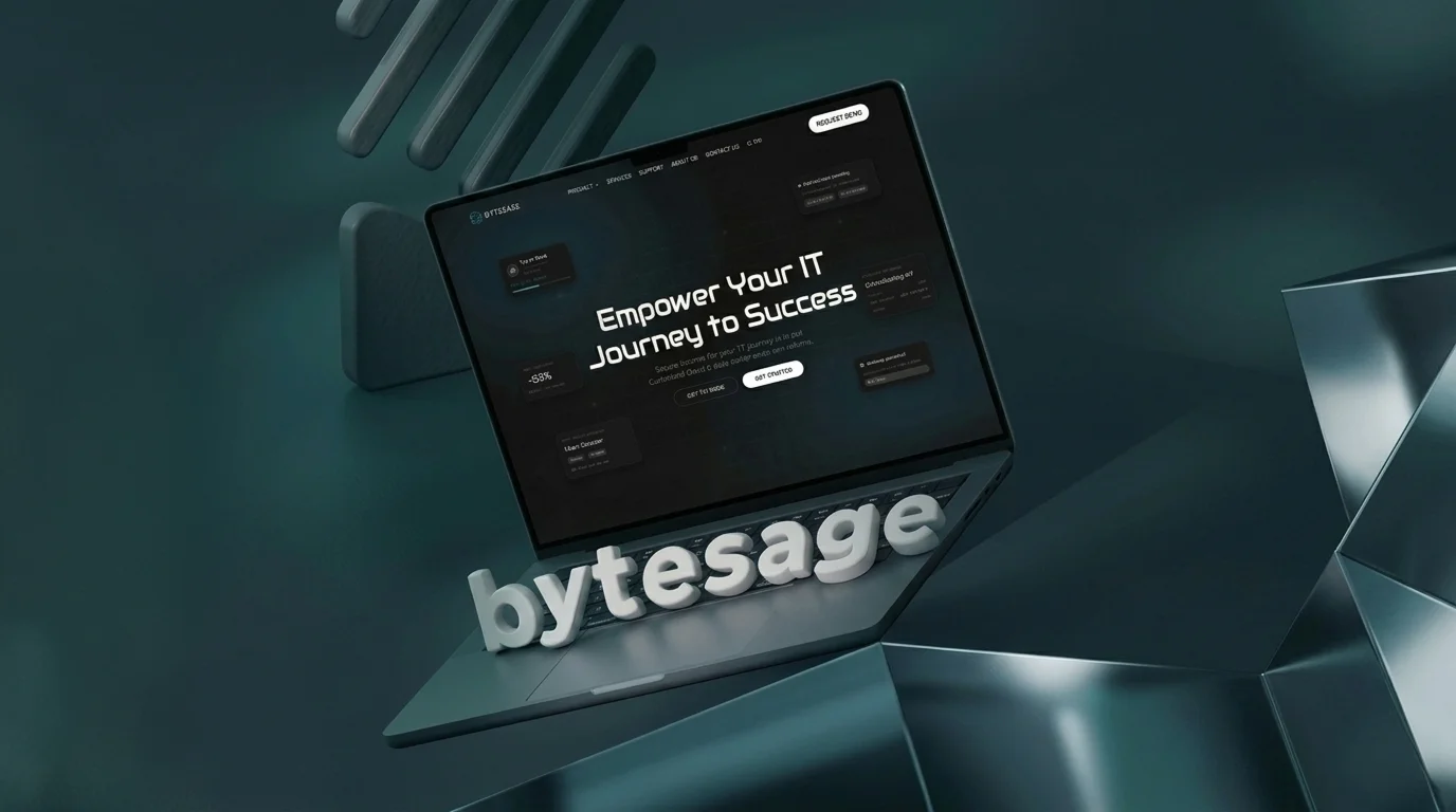
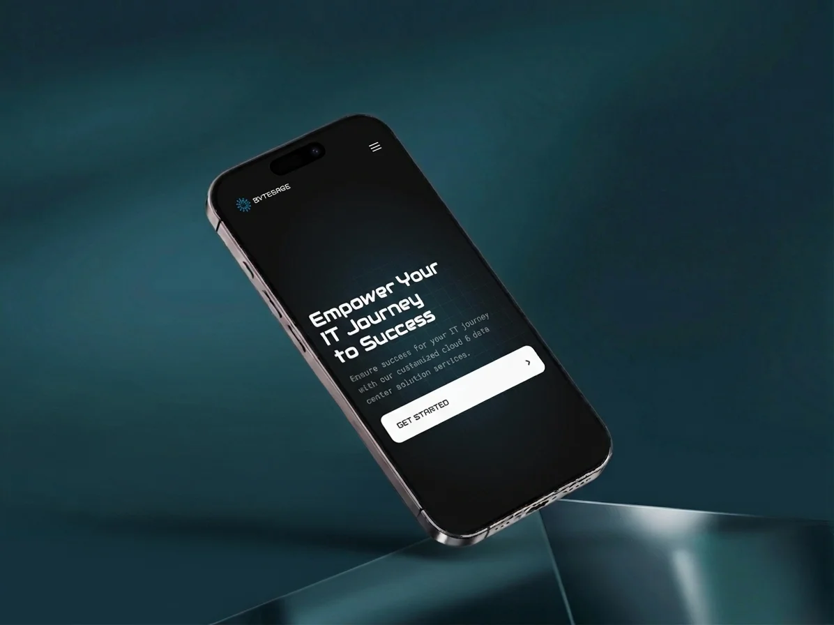
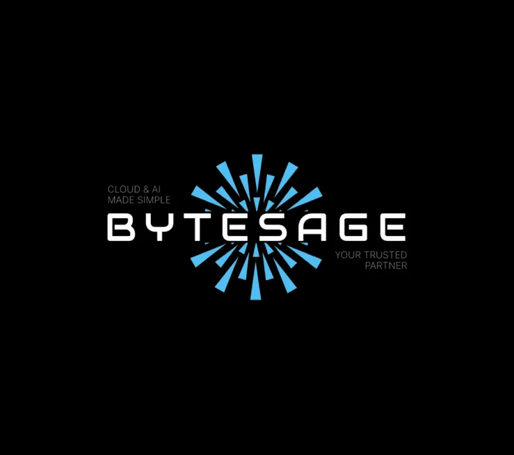
We built a bold, dark-tech visual system anchored in precision and confidence. The logo mark — a dynamic starburst — references both data complexity and clarity of execution. The website leads with outcomes, not features, guiding technical buyers from awareness to contact without friction.
Discovery
Positioning & Strategy
We started by mapping the competitive landscape across managed cloud, Oracle DBA services, and AI infrastructure vendors. ByteSage's true differentiator wasn't their service list — it was their team's pedigree and their refusal to hand clients off to junior engineers.
That insight became the strategic foundation: position ByteSage not as a vendor, but as an infrastructure team you hire — one that shows up, owns the outcome, and scales with you.
Branding
Visual Identity
The identity system needed to work across enterprise sales decks, the web, and technical documentation. We built it around a core tension: precision and dynamism — a brand that feels as reliable as infrastructure should, but alive enough to signal innovation.
The starburst mark was designed to scale from favicon to billboard. Deep navy backgrounds, electric blue accents, and geometric type give the brand a distinct voice in a space dominated by stock-photo IT imagery.
Design
Website & Interface
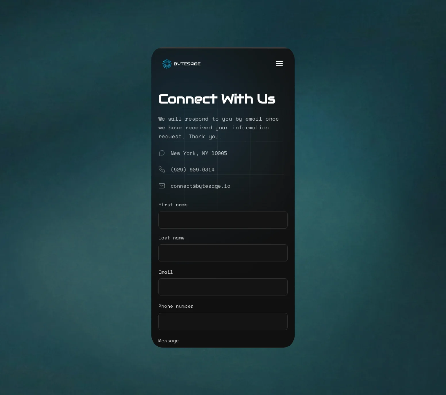
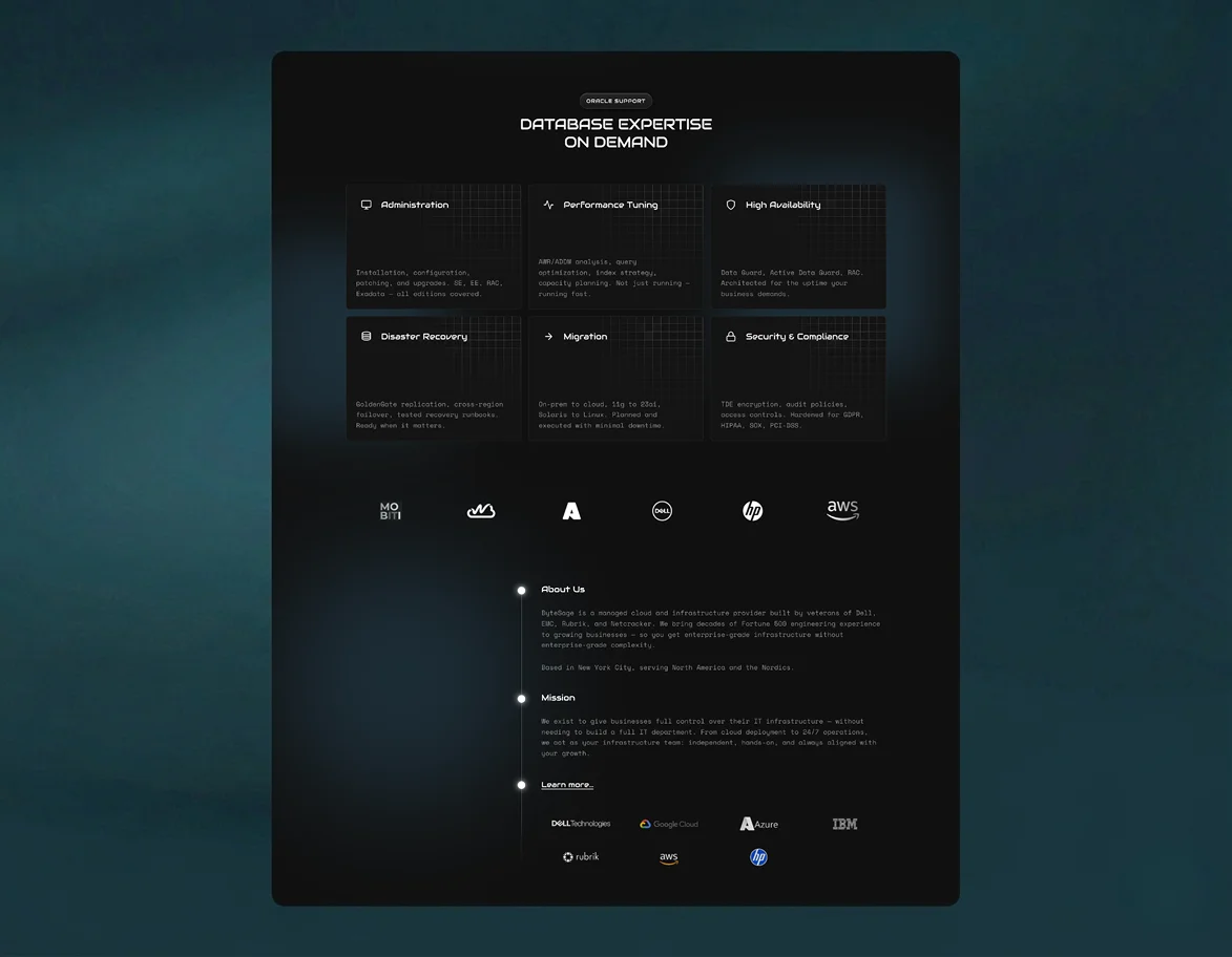
The website was architected to convert technical decision-makers. Above the fold, we lead with the core promise: enterprise-grade infrastructure, without the complexity. Below, structured service pages let buyers self-qualify before they ever fill out a form.
Oracle DBA expertise, cloud deployment, disaster recovery, and compliance sections each follow the same pattern — clear capability statement, technical proof points, and a low-friction next step.
Like what you see?